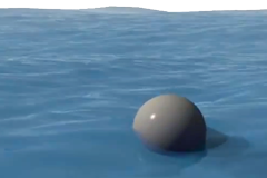
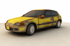
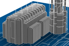
See the new light shapes/icons now available in Carrara. This video shows how to access the new light representations.
Blogroll
Carrara Plugins
Communities
offsite Tutorials
Useful links for Carrara
- 3DXtract Magazine (as single zip file)
- Carrara 1 Bible
- Carrara 1.0 for Dummies
- Carrara 3D Expo Magazine
- Carrara 5 Pro Handbook
- Carrara Information Manual by Dartanbeck
- DAZ Documentation Center (Carrara 8.5)
- DAZ Documentation Center (Carrara 8)
- Digital Lighting and Rendering (3rd Edition)
- Figures, Characters and Avatars: The Official Guide…
- German Carrara 8/8.5 Manual (Registration required)
- Infinite Skills – Video Training Tutorials
- The Carrara Studio 3 Handbook


woow…carrara 8.5 gets a step closer to be more professional piece of software 🙂 okay joking…….
what about the whole interface design?
why not make it fully customable ….select skins and iconsets for the navigation and buttons for example. make it more flexible. a realy excellent graphical layout and interface is shade12…perhaps for inspiration…..
And how it can be used in practice, how much it is useful?
maybe better DAZ added helix primitive to Carrara vertex modeler.
I am not very impress by the light shapes. Would be if they added more functionality to them to make more realistic lighting effects.
“See the new light shapes/icons now available in Carrara.”
HOW DO WE GET c8.5 ?
I have 8.1.153 Pro which I thought was latest.
never seen an option to get 8.5 !!!
Hello!
In my opinion light shapes are very useful. Before this renovation we never had any kind of representation that could help us to determine how will the shape light work out and usually it used to be pretty much hit and miss. Now the shape lights makes it a lot easier to determine how will the set up of light work. Things can always be better, I agree, but that is a good direction Carrara developers are headed. better than only have genesis support in Carrara 8.5 if you asked me.
Dear 2IDs media:design, I would be careful with the ui design. To me Shade 12 looks overwhelmed with buttons. Although I agree that Carrara could use some UI flexibility additions, I find blender’s current UI to be one of the best in terms of flexibility, but then again people get frightened when they see lots of buttons. I think Carrara should keep the nice minimal interface but add flexibility like scaling of individual 3D views etc.
these are my two cents.
Bets regards, 🙂